Send linket til app
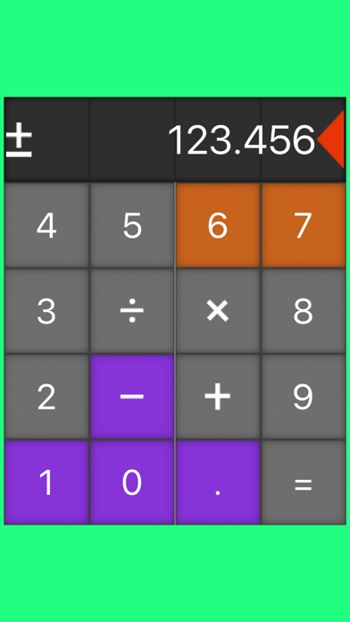
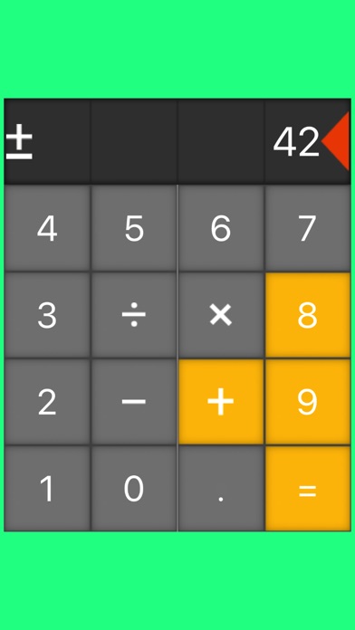
The first thing that catches your eye in this simple calculator app is a non-standard buttons placement. The numeric buttons are arranged clockwise in the outer circle, and the action buttons are in the inner circle (square). We have found out that this layout could be more convenient and useful than standard one, especially on the Apple watch screen. While you will do the calculations, color blocks will fall down on the screen, just to entertain you. Like in old beloved video games. Furthermore, the change of colors serves as an additional confirmation of the successful button tap. You should try it, it kinda grows on you. This is the Calculatris. Everything counts!


